Packaging
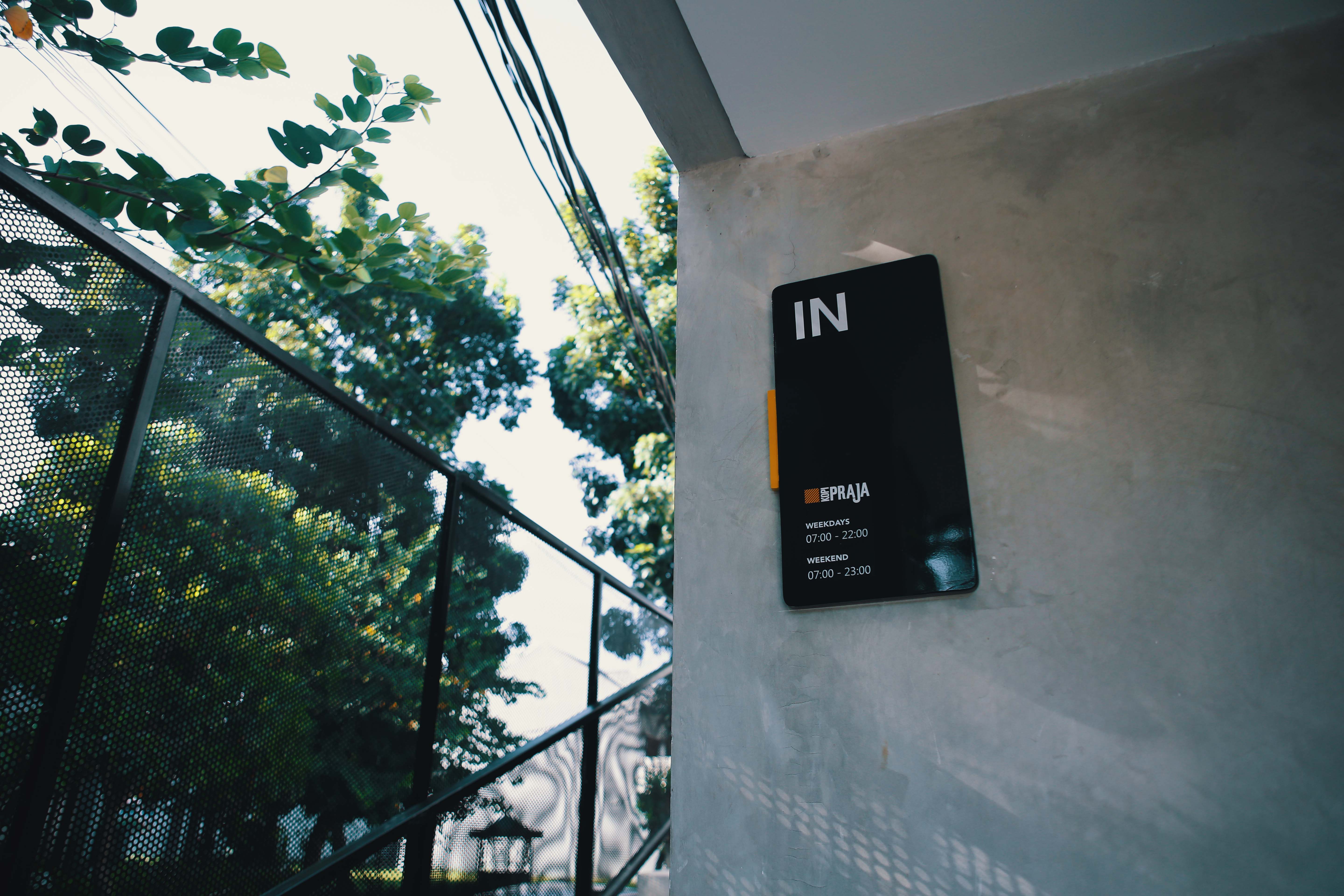
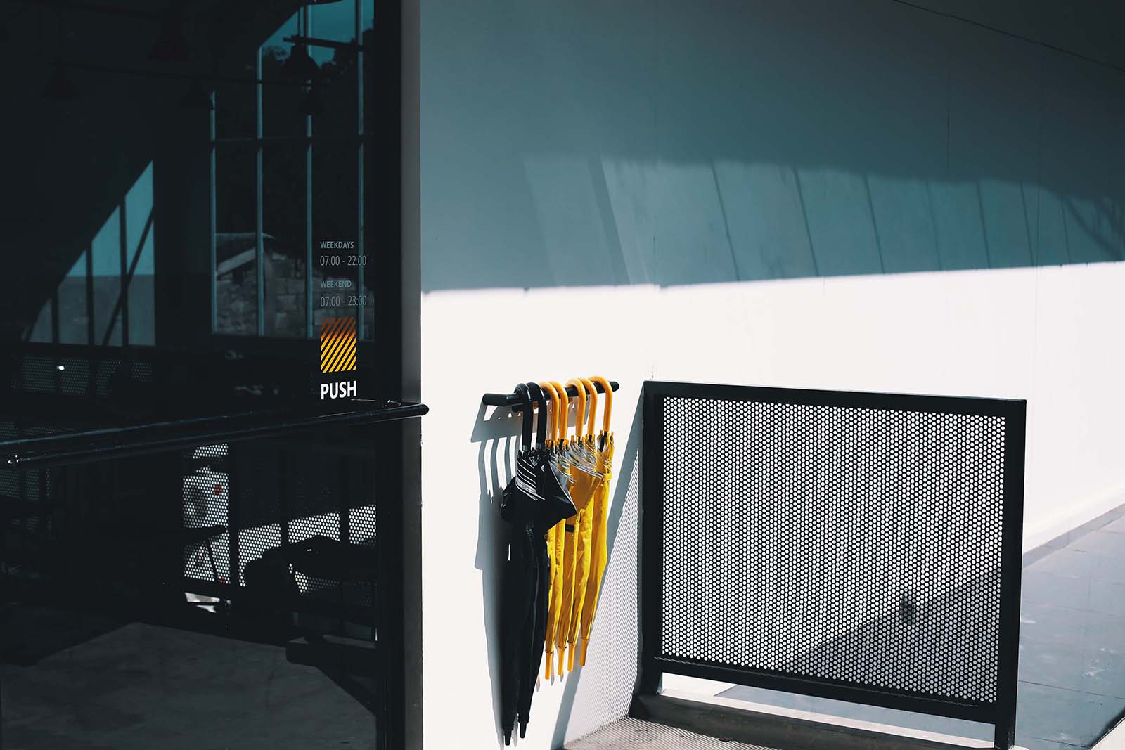
Signage
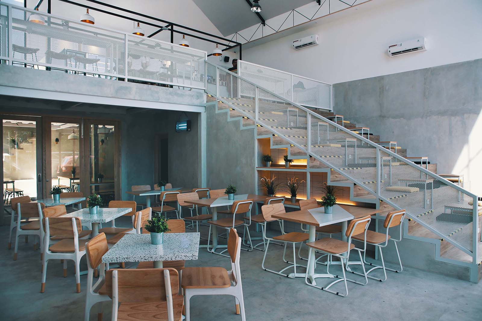
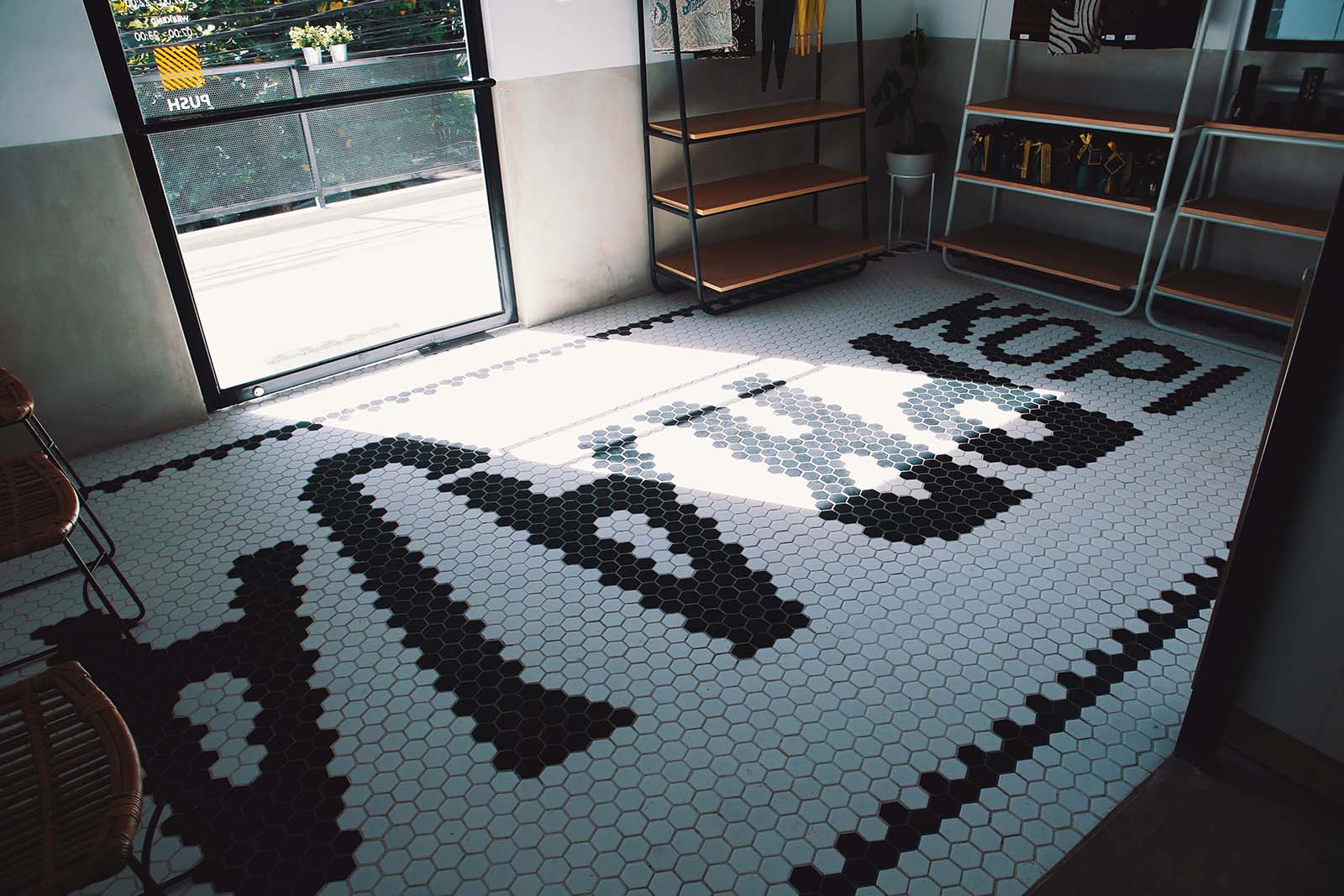
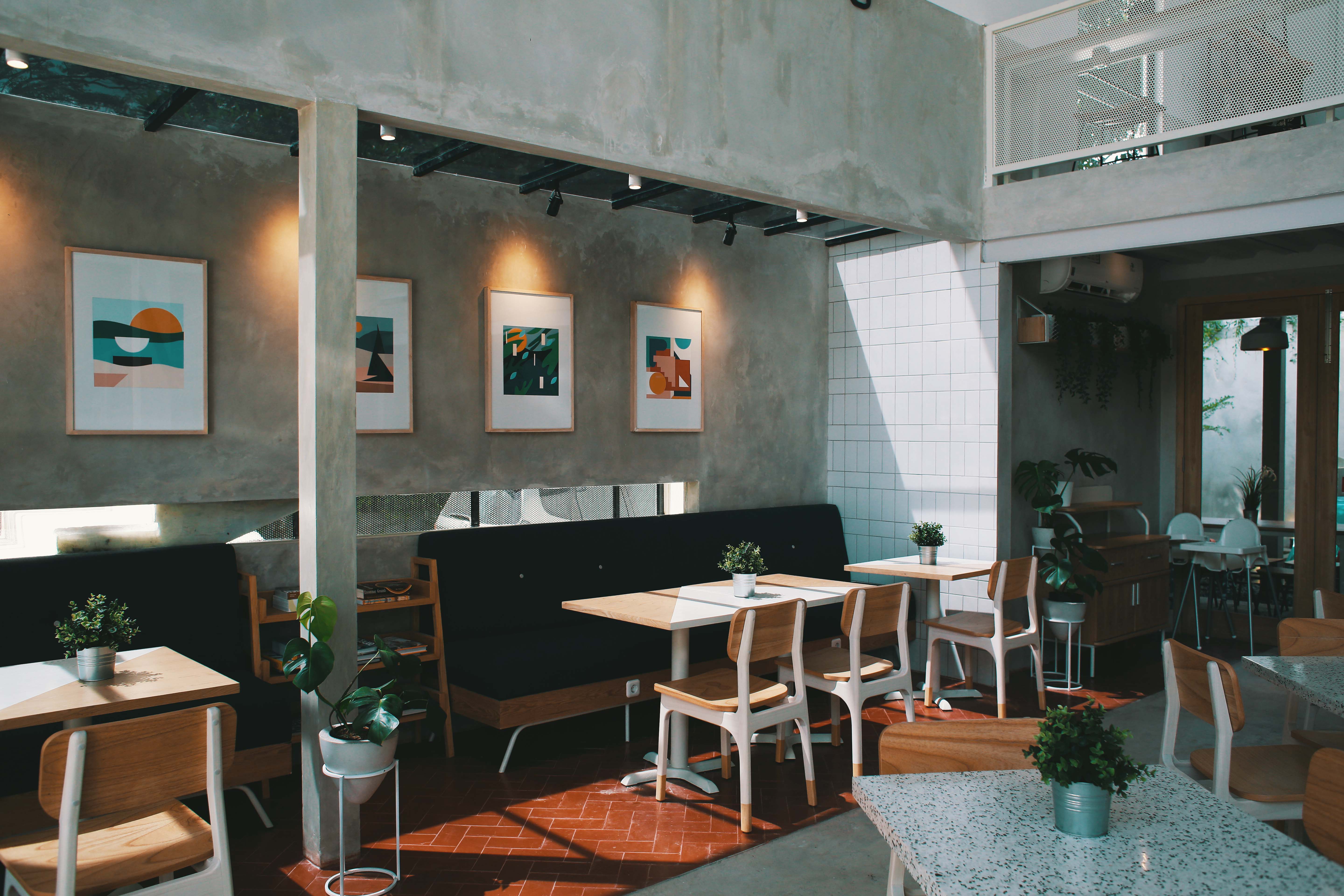
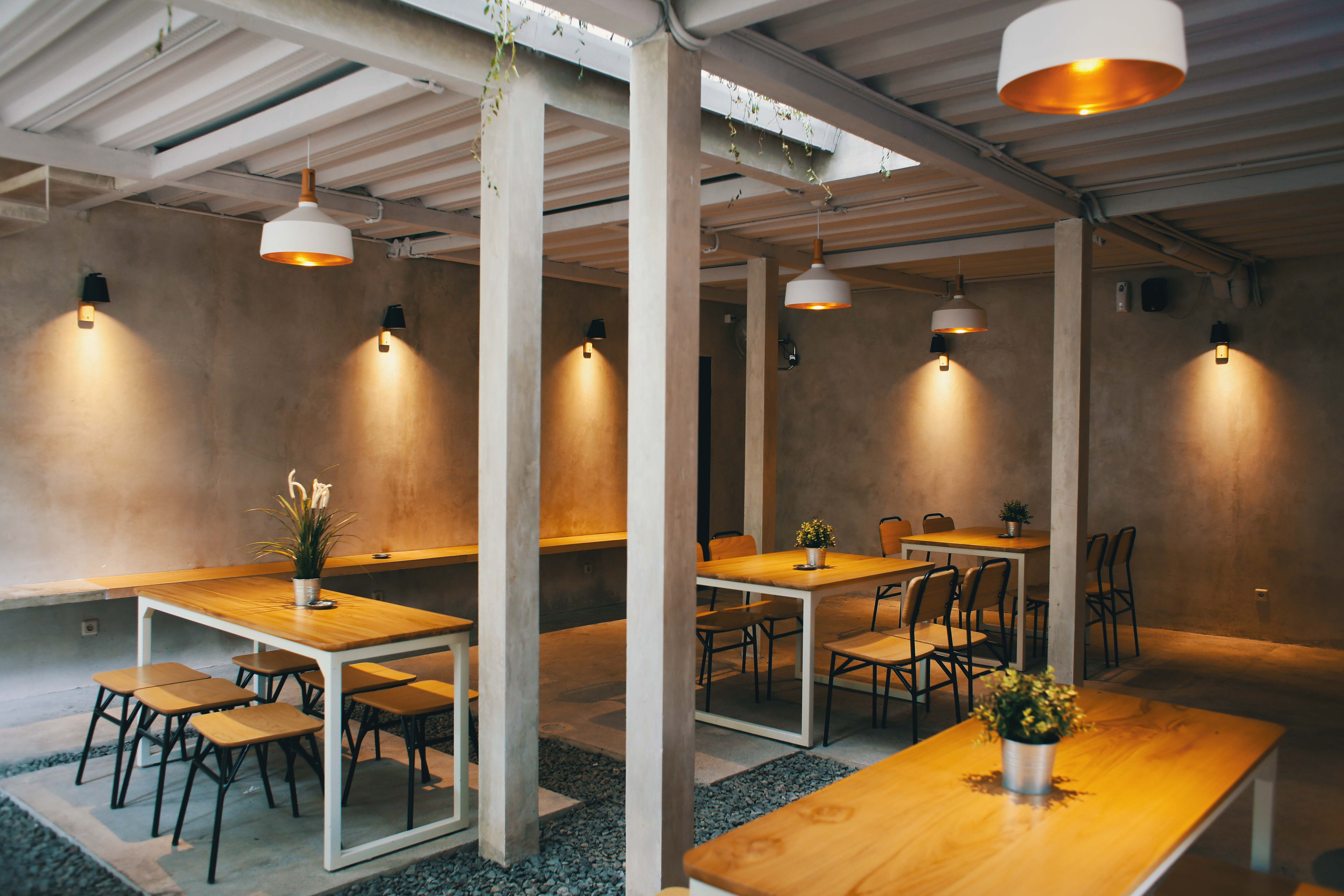
Interior
Diagonal Lines Mark the Spot
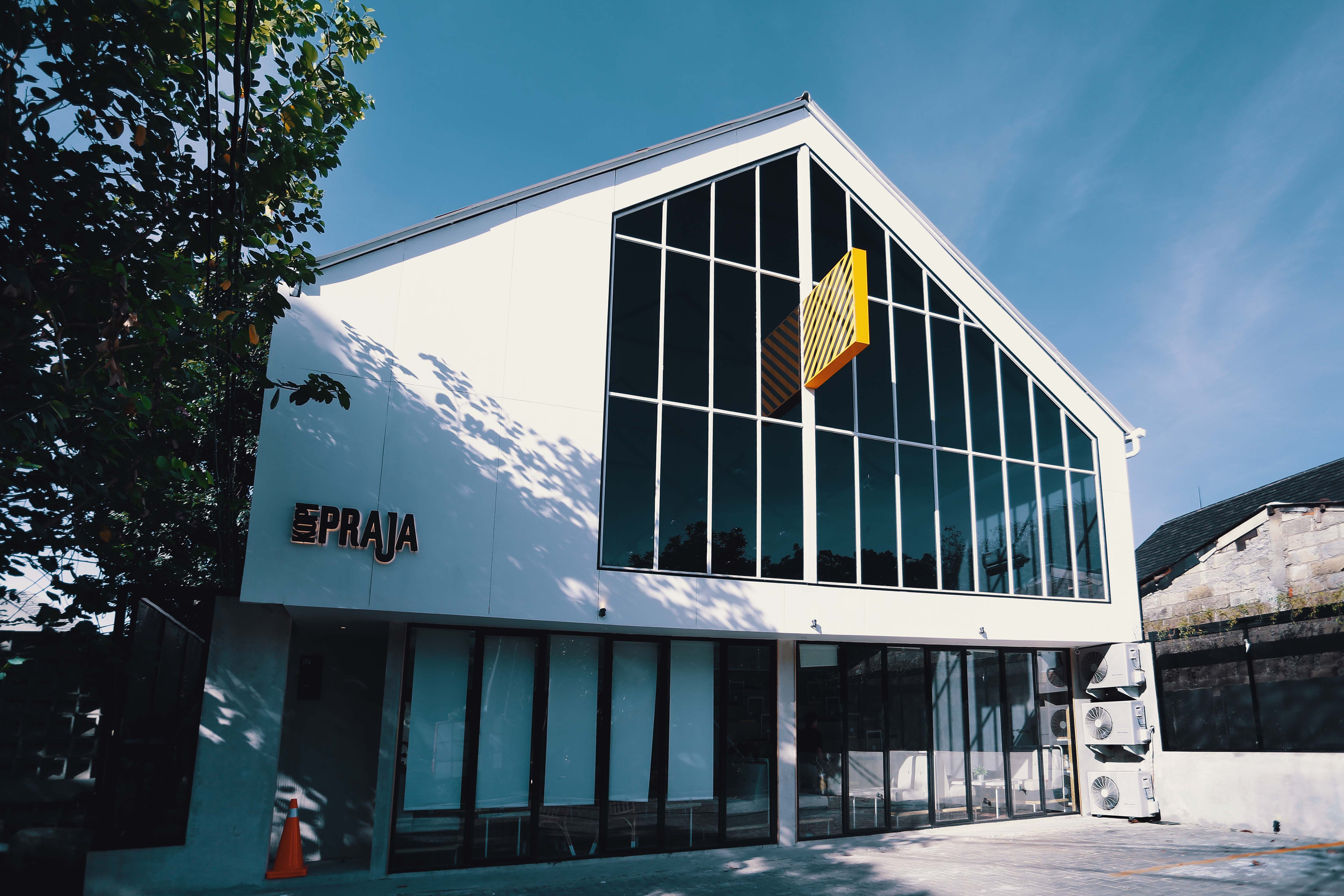
In 2017, Brofrank had the opportunity to create a comprehensive branding concept for a coffee shop project, from its naming, visual identity, to its interior. The project was located in Bintaro, where there were not any other coffee shops or cafes at that time. However, we saw the potential the area had.
The construction of the project is done in collaboration with Nuvosis. For the coffee shop’s name, we opted for an Indonesian word which carries the message of our larger concept, Kopi Praja. The word “praja” itself means city, village, or in a looser sense, an area. We wanted this place to be a community and working space that could make the area more vibrant.
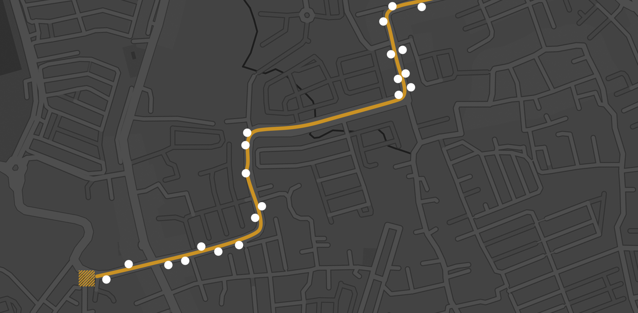
The logogram for Kopi Praja takes the form of diagonal lines, inspired by hatching technique commonly used to mark a spot on maps. Aside from acting as its visual identity, the graphic is also implemented in Kopi Praja’s pictogram and interior. Our goal is to create an iconic spot, both from its physical and visual aspect.
Years after Kopi Praja was opened, the area saw a notable growth, with other cafes and spaces around it. Kopi Praja managed to be the first place that sparked the development of its neighborhood, expanding the diagonal hatching on the map wider.
